

Flexbox is one of the most important tools available with developers for positioning elements in a web page. During the initial days of my career, I always had this inhibition that prevented me from using Flexbox. Maybe it is quite tricky and took time to learn! I wish I knew back then that it is a very simple and handy concept, which helps position our web elements with ease.
I always believed that the Flexbox is used mainly for improving the responsiveness of our web pages. When I learned that we could use Flexbox to position different elements within a container in different ways, I felt sorry for not using this earlier. It is always better to use Flexbox to position elements when you can, rather than falling back on top, right, bottom, left positioning elements. It is simple, yet fun. I will try to give you a fair understanding of how to use Flexbox.
Flex container and Flex items
A Flexbox essentially includes the flex container and the flex items.
The container which has its display set to flex is a Flex container. All the immediate child elements of the Flex container are the Flex items.
.container {
    display : flex
}
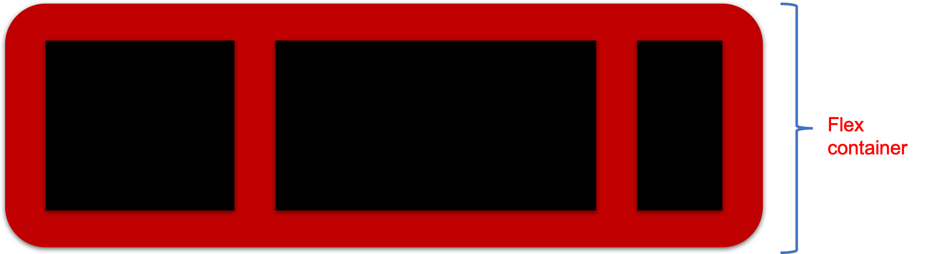
Here, the red box is the Flex container and the black boxes are the Flex items.
Flex container and the Flex items have different properties which help us to position elements.
Properties of the Flex Container
- display
- flex-direction
- flex-wrap
- flex-flow
- justify-contents
- align-items
- align-content
display
As discussed earlier, display property decides if a container is a Flexbox. When this is set to flex, a container becomes a Flexbox.
.container {
    display : flex
}
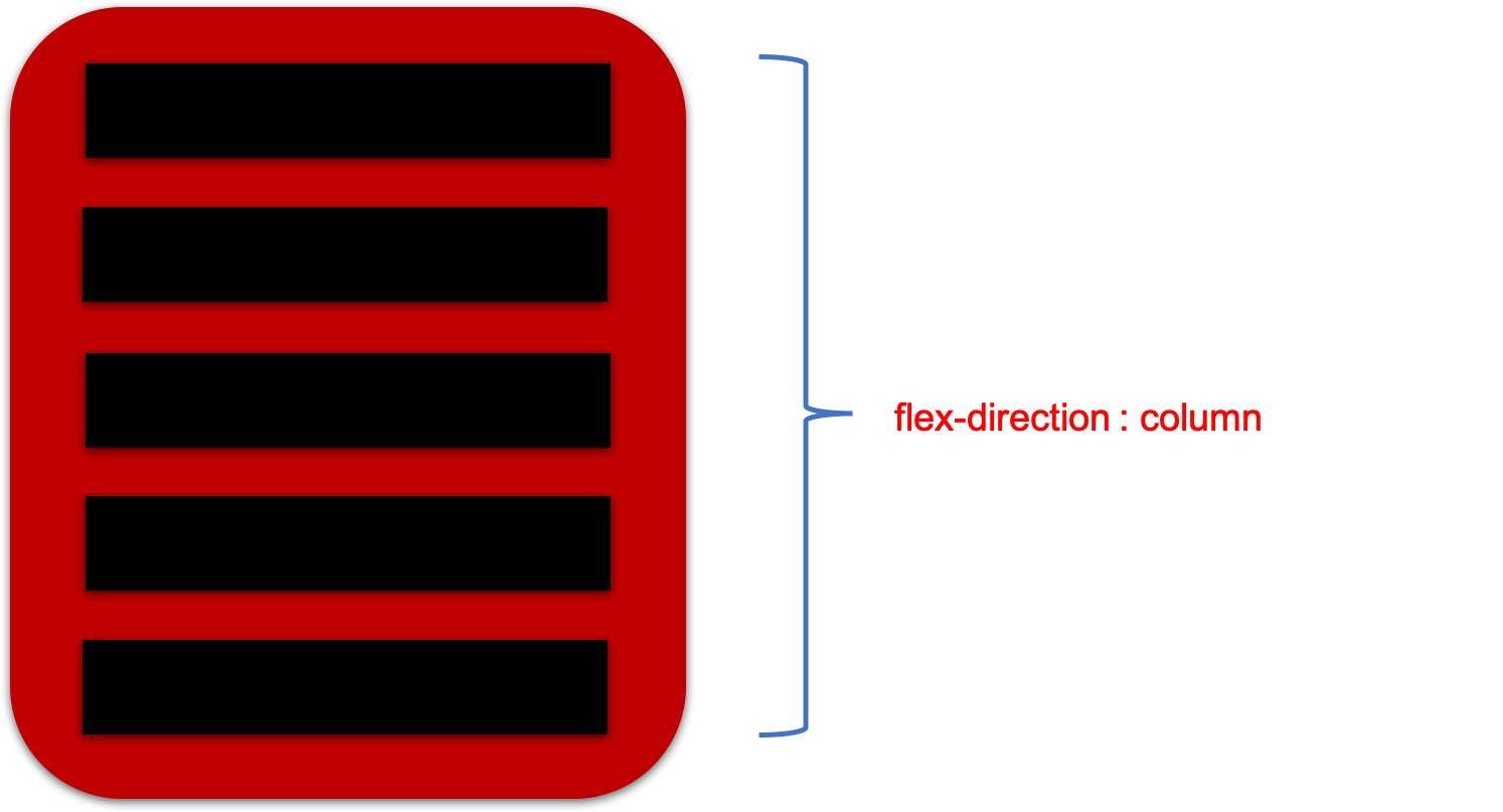
flex-direction
It defines the direction in which the Flex items are placed in the Flex container. It can take up one of the four values given below.
- row
- row-reverse
- column
- column-reverse
Flexbox is a single directional layout and you can use the flex-direction property to set the direction in which the Flex items get stacked.
.container {
  flex-direction: row | row-reverse | column | column-reverse;
}
- When the value is set as row, the elements are stacked horizontally from left to right.
- When the value is set as row-reverse, the elements are stacked horizontally from right to left.

- When the value is set as column, the elements are stacked vertically from top to bottom.
- When the value is set as column-reverse, the elements are stacked vertically from bottom to top.
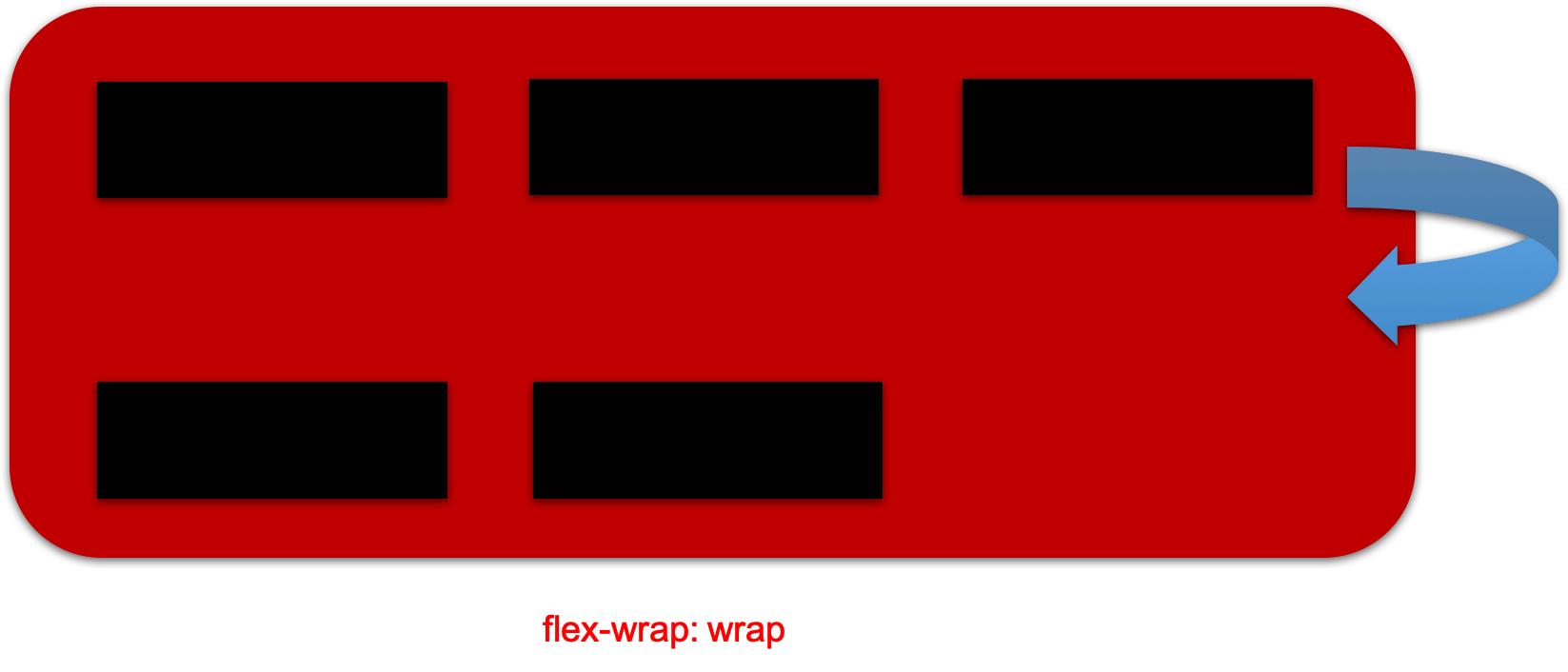
flex-wrap
By default, all the Flex items try to fit into a single line. This can be changed by using the flex-wrap property. It can take one of the following values.
- no-wrap
- wrap
- wrap-reverse
.container {
  flex-wrap: nowrap | wrap | wrap-reverse;
}
- no-wrap is the default value. All Flex items fit in a single line.

- wrap will get Flex items wrapped from top to bottom.
- wrap-reverse will get Flex items wrapped from bottom to top.